Marc Librescu in The Comics Journal.
![]()
Dan Piraro is the creative mind behind the award-winning cartoon Bizarro. First syndicated in 1985, Bizarro has developed a loyal following and now appears internationally in more than 350 daily and Sunday newspapers.
Piraro was born in Kansas City, Mo., and grew up in Tulsa, Okla. He left Washington University in St. Louis after attending for one semester. He later worked as a commercial artist in Dallas, Texas, before moving to New York City In 2002. Piraro has published 13 Bizarro collections, along with three other books. Bizarro Among the Savages (Andrews McMeel, 1998) detailed his exploits during a book tour that was completely funded by his fans (he even stayed in their homes). The Three Little Pigs Buy the White House (St. Martins, 2004) is a satirical look at the Bush administration in the form of a children’s book. Bizarro and Other Strange Manifestations of the Art of Dan Piraro (Harry N. Abrams, 2006) is a retrospective of his careers as a cartoonist, fine artist and commercial illustrator.
![]()
![]()
![]()
![]()
![]()
![]()
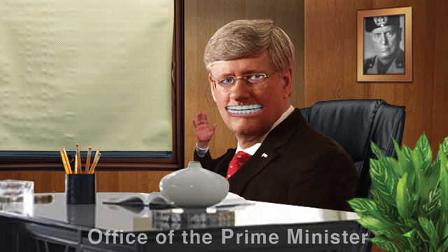
Fox News Special Report, watercolor and colored pencil, 10″x14″.
Dan Piraro is the creative mind behind the award-winning cartoon Bizarro. First syndicated in 1985, Bizarro has developed a loyal following and now appears internationally in more than 350 daily and Sunday newspapers.
Piraro was born in Kansas City, Mo., and grew up in Tulsa, Okla. He left Washington University in St. Louis after attending for one semester. He later worked as a commercial artist in Dallas, Texas, before moving to New York City In 2002. Piraro has published 13 Bizarro collections, along with three other books. Bizarro Among the Savages (Andrews McMeel, 1998) detailed his exploits during a book tour that was completely funded by his fans (he even stayed in their homes). The Three Little Pigs Buy the White House (St. Martins, 2004) is a satirical look at the Bush administration in the form of a children’s book. Bizarro and Other Strange Manifestations of the Art of Dan Piraro (Harry N. Abrams, 2006) is a retrospective of his careers as a cartoonist, fine artist and commercial illustrator.
Bizarro is one of the few bright lights in today’s newspaper comics page. Combining a mix of offbeat humor with an occasional smattering of politics and animal activism (Piraro has been a vegan since 2002), the cartoon has won three consecutive Best Cartoon Panel of the Year awards from the National Cartoonists Society. In 2010, Piraro received their highest award, the Reuben Award, for Outstanding Cartoonist of the Year.
Piraro regularly gives talks and performs comedy across the country. His one-man stand-up comedy show, The Bizarro Baloney Show, made its debut at the 2002 New York International Fringe Festival, where it was voted Best Solo Show.
He spoke with me by phone from his home in Brooklyn, N.Y., where he lives with his wife, Ashley Lou Smith.
— Marc Librescu
Marc Librescu: In the introduction to William Steig’s book, Ruminations, Whitney Balliett talked about “the mysterious line that separates cartoonists from artists.” Balliett said, “Cartoonists are sketchers who deal in obsolescence, whereas artists, more heavily equipped, aim at permanence.” As a cartoonist who also creates fine art, do you agree that cartoons are ephemeral?
Dan Piraro: [Laughs.] You’re starting with the softballs and you’ll be getting to the harder questions later, huh?
I don’t think hard about these issues. Charles Schulz, who was a wonderful friend and a pleasure to all cartoonists who were lucky enough to meet him, had a sort of chip on his shoulder about the separation of cartoons and fine art. He felt that cartoons were every bit as important in society and the creative world as fine art and he wanted to see cartoons in the Louvre. Norman Rockwell was another person who was separated by some as an illustrator and others as a fine artist. I don’t know how much that bothered Norman, but there has always been that kind of debate.
Quite honestly, I just don’t care. I think that creative efforts are what they are. You reach down into your soul, pull something out, and you throw it out there. There’s no way to control how it’s accepted or not accepted by individuals or by society as a whole, and it is of no concern to me.
Humor gets dated quite often. If you look back at some of the cartoons from the early 20th century, they just aren’t funny or they don’t ring the same bell or push the same buttons that they did then. But then others do. There’s no way to predict the future. I don’t know what about my cartoons will or won’t be relevant in 50 or 100 years and I won’t be here to care, so I don’t worry about it.
I always thought of cartooning as being a job. I try to make it as much of an art form as I can, but in my own mind, I sort of separate it. I think, well this is a job. It’s not pure creativity. There are a lot of rules that I have to go by. I can’t touch on certain subjects. The cartoons have to make a certain amount of sense and have a certain context. They have to be understandable to most people, and hopefully, amusing to most people. There are just a lot of rules. It’s a product that I’m on deadline for, getting paid for and under contract for.
So I think of it as more of a commercial venture that I try to put as much creativity and soul into as I can, given the guidelines. Whereas with fine arts, I just go for it — straight from the heart. Whatever happens happens. I don’t think about the audience. I don’t think about the time frame. I just enjoy the creative process. Once again, where it ends up in history or in anyone else’s mind is beyond my control, so I don’t worry about that.

Librescu: You mentioned in your book, Bizarro and Other Strange Manifestations of the Art of Dan Piraro, that, if you made enough money with your cartooning, you’d like to do fine art. I wonder about people like Gary Larsen, who’ve retired from cartooning. If you found yourself in that situation, would you still need to communicate via cartoons in the same the way as when you were doing it as a job?
Piraro: I don’t know. I’ve wondered about that myself. The further I go down this road, the more I think about getting out of it, only because I’ve been doing it for over 25 years now — a cartoon a day for over 25 years. And it’s getting more and more like a prison sentence in the sense that I can’t escape it. Yeah, I feel very fortunate to be doing it and I enjoy it. It’s so much better than any number of other jobs.
In 21st century United States, you certainly cannot complain if you’re making a living as an artist — period. You just can’t. It’s like complaining that you won $10 million in the lottery instead of a hundred million. So, I like my career, but I’d love to change. I’d love to be able to get away from the 365-day-a-year responsibility because the downside is that I don’t get any vacations unless I work twice as many hours for x amount of time. I don’t get any time off for grieving, illnesses, or injuries. I just have to work through whatever happens. And that becomes an incredible grind after a quarter of a century. I’ve been through any number of funerals and I’ve been through a divorce and a couple of breakups and my dog died and who knows how many bouts of influenza. At that point it becomes really grueling.
So I’d love to get away from it and do fine art. I think about that. I ask myself if I’ll miss the daily contact that I have with my readers. When I send stuff out there, I know that they’re reading it. I don’t watch them read it, or hear from each one of them, or get their opinion on every cartoon, but I know they’re out there. So there’s this kind of connection that I have with my readers. And I wonder if I’ll miss it, and if I’ll occasionally come up with cartoon ideas. If I do, I’ll draw them and put them on my blog. If somebody sees them, then I guess that’s a good thing.
I’m sure there would be a certain amount of withdrawal. And I’ve often thought specifically about Gary Larson. What in the world is he doing with his time? Not that cartooning is the only thing that he can do. But I’m driven by ambition. I wouldn’t be happy sitting in my house for the rest of my life just painting and leaning the paintings up against the wall. I’d want to succeed. I’d want to get them in galleries, start selling them, and build a following. I’d want to get my art out there so it communicates with other people. To me, that’s a big part of the process.
It’s not that way for all artists. Many do it purely for the sake of art. But I really like sharing it and getting stuff out there. People often look at someone who’s already successful and ask, “Why do they bother? Don’t they have enough money? Why are they still working so hard? Why are they still trying to succeed? Why are they complaining about this, that, or the other? They’re famous. They’re rich. They’ve got the awards. What drives them?”
Well, it’s ambition. If I won the lottery tomorrow, I wouldn’t quit working and just sit around and watch TV, travel and scuba dive for the rest of my life. It’s fun, but it isn’t enough. There’s something in me that makes me want to set goals and achieve them.
So, I don’t know what life after cartooning will be like. I’m looking forward to finding out, but I don’t know that I ever will. I may be…
Librescu:…forced into a life of cartooning.
Piraro: Yeah. I may be stuck doing this until I drop just because I need the paycheck.
Librescu: It beats working in the coal mine.
Piraro: It absolutely does. It beats working in any cubicle in the world, for that matter.

Librescu: Which cartoonists influenced your work?
Piraro: [Pause.] I’m lighting a cigar. That was the reason for my pause. It wasn’t because I was thinking.
I enjoyed newspaper comics when I was a kid, but magazine cartoons were my favorites. I loved the one-off gags that I saw in the New Yorker, even more than the comic strips with story lines and regular characters. Nowadays it’s almost exclusively the New Yorker that runs single-panel cartoons, but when I was a kid in the ’60s and ’70s, almost every magazine was full of them. That’s what they did. I have no idea why they stopped it. It’s not expensive for publications to buy those things and everybody loves them. I cannot even fathom the logic behind not doing that any more, but they don’t.
Anyway, those were my favorites. I just loved the surprise quality of this weird, one-off image without regular characters that magazine cartoons provided. I thought they were the coolest thing ever. I enjoyed the little mental trick of looking at a slice of a moment and wondering what happened right before this picture, and what was going to happen right after, and reading the caption, and putting it all together in your head. Solving that puzzle in your head was such a thrill for me. That’s why I designed Bizarro the way that I did.
I really admired people like Schulz. I was also a big fan of Tumbleweeds by Tom K. Ryan, partly because I loved cowboys and Indians (which was my main game when I was a little kid), but also because of the way it was designed. It has a really strange, abstract character design. I’m still a fan of the way he draws.
I became a fan of the New Yorker cartoonists at an early age. I loved Gahan Wilson. The National Lampoon cartoons were terrific. Gahan Wilson, Charles Adams, all those early New Yorker guys whose names I can’t remember any more because they haven’t been in the magazine now for quite a while, and more recently people like Jack Ziegler and Mick Stevens. I guess those guys have been around for quite a while, too.
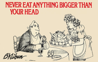
Those are the people who influenced me. Then when I was in college, my main influence, by far, was Kliban. My roommate had one of his offbeat books, not the cat one that made him millions… in fact, it was Never Eat Anything Bigger Than Your Head. I looked through it and it changed my world. I loved the bizarre way Kliban drew. It was just so amazing. These were not classic traditional gags with a certain set-up and rhythm. They were really just the strange musings of a creative man, in graphic form. I found that so appealing. It really pulled me in.
I’d never really drawn cartoons before. I’d always admired and enjoyed them, but I never drew them. When I saw Kliban’s work, I started drawing these strange musings out of my own mind. A few years later, I started sending them off to syndicates and tried to get syndicated. What stopped me from doing it earlier was that I’d gotten out of the habit of reading newspapers and I didn’t know how to get into magazines. That seemed like a lot of work. You had to figure out who at the magazine you had to send your stuff off to. It seemed like such a long shot. As an illustrator, I was an introvert. I wasn’t a natural salesman, so it was a difficult thing for me to manage.
I hadn’t read the newspaper in ages. In the early ’80s when I was a young adult looking for something to do for a living, I thought of the newspaper as a place where only cartoons like Marmaduke and Dennis the Menace were welcome. I was working at an ad agency one time, an in-house ad agency at Neiman-Marcus of all places, and a lot of my colleagues enjoyed my cartoons. They said I should try to get them syndicated in the paper. I said, “They don’t print that kind of stuff.” Somebody brought in a Far Side cartoon, which had only been in the paper for a few years at that time, maybe three or four years. I’d never heard of it and had never seen it. And I thought, “Oh my God, this is a magazine-style cartoon! They’re putting magazine-style cartoons in the newspaper now!”
That was the impetus that got me to start mailing my stuff to the syndicates. A couple of years later, I got signed. As The Far Side picked up popularity and steam, all the syndicates said, “Let’s start putting some of these magazine-style cartoons in our lineup.”
It wasn’t really Larson who inspired me as much as it was his editor, who started selling that kind of work to newspapers. I always felt like that was the moment that changed the face of newspapers. His name was Stan Arnold. He changed the face of newspapers because he recognized the potential of getting that kind of humor into the funny pages. And it worked. People like it.
Librescu: Aside from the occasional original comic strip or cartoon, newspaper comics are pretty bad as a whole.
Piraro: Yep. I agree.
Librescu: While comics have been evolving in different media, such as graphic novels and animation, newspaper cartoons by and large have been stuck somewhere between the late 1950s and the early 1960s. Why?
Piraro: I have theories about it. I don’t know a lot of newspaper editors personally, but I know a lot of syndicate salesmen, and they know every newspaper editor. Some of the information I’ve gotten from them is basically that newspaper editors think of themselves as journalists. They’re all about the news. There are a handful around the country who are fans of cartoons and who really want to make that part of the paper special. But for the majority of them, it’s just a job that’s tacked on to their regular journalism job. They’re responsible for picking cartoons to put in the newspaper, but they don’t take it terribly seriously.
It becomes a path of least resistance. Editors aren’t out to find the best, most creative and newest thing. They’re basically out to fill those pages with things their subscribers are going to enjoy. Subscribers have been enjoying Beetle Bailey for 45 years, or 60 years, or whatever. If they take it out, a lot of people complain. So they leave everything in there. They leave in anything that has a following. They don’t want to spend a week answering angry letters from people who need their Nancy fix.
That’s part of the problem. Then you have young guys coming up — and I made this mistake myself at first — who look at the newspaper and they go, “This is the stuff that’s popular. I’m going to create cartoons like this.” So they don’t push the envelope. When they do, it reduces their chance of getting signed, so they just don’t do it.
The syndicates have been guilty of that themselves. They look at what has sold and they continue to offer what’s been successful in the past. You know, if it ain’t broke, don’t fix it. So that’s what they do. It’s a generational thing. It’s sad to say, but it takes editors and syndicate heads getting old and dying, and turning their jobs over to younger people who still believe — erroneously — that they can change the world. [Laughs.]
You have to wait until the old guard is gone and the new folks come up to even take baby steps. It’s a very slow process. For the longest time, the people who have been choosing comics for the newspaper were almost exclusively white men over 60. Not always, but often. They’re guys that have been in the newspaper business forever. How varied can the taste of that subset of Americans be?
The hardest part of syndication is that there’s no ratings system, so no matter how many newspapers you’re in, you have no idea whether you have one reader or a million. You could be in 2,500 newspapers around the world and have no fans. It may be that no one reads your cartoon or that nobody likes it. You don’t know. In any given market your entire career relies on a single person.

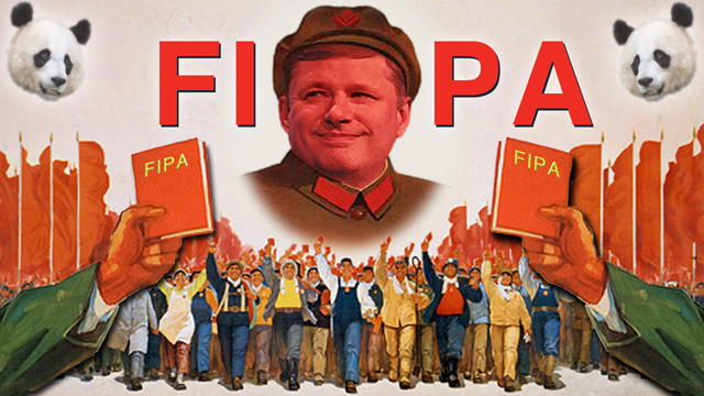
Fox News Special Report, watercolor and colored pencil, 10″x14″.
Librescu: In your personal artwork, there’s some reference to Dali. I can see that you’re interested in Surrealism. What other artists do you admire?
Piraro: I grew up in Oklahoma, where there was something of a cultural vacuum. My parents weren’t big art fans. There really wasn’t any art influence in my house, other than the encyclopedia, which had a section on fine art. It had probably 25 or 30 of the most famous paintings through history. We also had a big illustrated family Bible, bound in leather or something. It had all this Renaissance art in it. I also went to Catholic school and attended church 29 times a week. That had the stained glass, the paintings and the statues, which are all based on Renaissance and Baroque art.
Those were my earliest influences, and I still really love it. In my fine art, as you’ve seen from my book, I used a lot of religious imagery, even though I’m an atheist. I love to paint in that style. In fact, I taught myself to paint by reading about the techniques of Raphael. I taught myself to oil-paint in that same manner and was able to get similar effects as that sort of rich Renaissance/Baroque realism. Michelangelo and Da Vinci were my favorite artists when I was growing up.
I was a huge fan of Salvador Dali because he painted in the same style that I loved but he used stranger subject matter. Those were my early influences: the Italian and Spanish Renaissance painters and Salvador Dali. As an adult, I’ve come to like many kinds of art but those were my real artistic influences.
Librescu: You’ve mentioned a number of times that you’re not a fan of Rothko or that type of modern art. What’s your take on contemporary art? Do you go to galleries? If so, do you see anything you like?
Piraro: Yeah, I do. I don’t follow the art world very closely, so I couldn’t name many contemporary artists who I really like. I like Mark Ryden. I think his style is called lowbrow art. I don’t like fantasy art, but I like strange images, like an eerie waif standing in the snow with the image of Abraham Lincoln floating in the trees. There’s a certain kind of serious weird art that I really like.
 |
| Four Clerics Ignoring a Vision, oil on linen, 48″x48″, 1995. |
I really hated art in the ’70s, which is when I went to art school. I had a scholarship to Washington University in St. Louis, but I quit after one semester. At the time, everything was conceptual. It was the only thing that you could learn in art school and it was the only thing you could do and get anything above a C for. This literally happened in one of my classes. A kid turned in a pile of broken glass with about a three-page explanation of what it meant and got an A, and I turned in something that looked recognizable and got a C. That was the day I thought that this was not for me. Back then, it was all conceptual art.
At the time, the art world had decided that since the invention of photography, there wasn’t any reason to try to represent anything artistically in paintings. So everything that looked like anything was just out. That has now reversed, as all trends do, and a lot of people are painting more realistically.
I don’t like strict realism. Well, maybe I do like it. It’s fine, but I don’t paint that way. I like to throw in a little trompe l’oeil. I like to draw freehand on top of the realistic stuff and combine different elements. That’s the sort of art that I really enjoy now, art that combines elements of realism with graphic line art or more abstract images.
When I say “abstract,” I’m not talking about Jackson Pollack. Jackson Pollack is not abstract. Abstract is changing an image to some degree, but you can still basically tell what it’s supposed to be. That’s true abstract as opposed to Rothko or the big red square. Most people say that’s abstract art, but it’s not. It’s conceptual or something else. I don’t even know what they call that.


_AnitaKunz-Galleryhouse")