The Ting Comic and Graphic Arts Festival takes place next month in London, Ontario and the fest has just revealed an amazing poster and t-shirt design by cartoonist Jesse Jacobs. As well, they have added Seth to their guest list.
Named after Merle Tingley, (Ting) the editorial cartoonist for the London Free Press from 1948 – 1986, the festival is a homage to his work and his influence on this generation of artists who revere his mascot ‘Luke Worm’ and his incredible body of work.
Centering around a gallery show at The ARTS Project, the festival will also feature comics for sale, workshops, panel discussions and more. The dual purpose of the festival is to provide a forum for artists to present their work to the public not normally accessible through normal commercial channels and to raise awareness of The ARTS Project, a non-profit arts incubator based in London, Ontario.
The Wright Awards have announced their nominees for 2014. The Awards event takes place during the Toronto Comic Arts Festival. The nominees for the 2014 Doug Wright Award for Best Book are:
• Palookaville #21 by Seth (Drawn and Quarterly) • Paul Joins the Scouts by Michel Rabagliati (Conundrum Press) • Science Fiction by Joe Ollmann (Conundrum Press) • Susceptible by Geneviève Castrée (Drawn and Quarterly) • Very Casual by Michael DeForge (Koyama Press)
The nominees for the 2014 Doug Wright Spotlight Award (a.k.a. “The Nipper”) which recognizes Canadian cartoonists deserving of wider recognition are:
• Connor Willumsen for Calgary: Death Milks a Cow, Treasure Island, Mooncalf, and Passionfruit • Dakota McFadzean for Other Stories and the Horse You Rode in On (Conundrum Press) • Patrick Kyle for Distance Mover #7 – 12, New Comics #1 – 2 • Steven Gilbert for The Journal of the Main Street Secret Lodge • Georgia Webber for Dumb # 1 – 3
And the nominees for the 2014 Pigskin Peters Award, which recognizes the best in experimental or avant-garde comics, are:
• Calgary: Death Milks a Cow by Connor Willumsen • Flexible Tube with Stink Lines by Seth Scriver • Journal by Julie Delporte (Koyama Press) • Out of Skin by Emily Carroll • Very Casual by Michael DeForge (Koyama Press)
A feature event of the Toronto Comic Arts Festival (TCAF), The Doug Wright Awards are pleased to announce that the pioneering artists of the Second World War “Canadian Whites” comics will be formally inducted into The Giants of the North: The Canadian Cartoonists Hall of Fame during the ceremony on Saturday May 10, 2014 in Toronto.
The Canadian Whites were black-and-white comics produced between 1941 and 1946 that contained a host of original (and iconic) Canadian characters such as Johnny Canuck, Canada Jack and Nelvana of the Northern Lights. These characters were created by the likes of Murray Karn, Adrian Dingle, Gerry Lazare, Leo Bachle and Jack Tremblay. The event will also serve as the official launch of a new collection of the complete Nelvana of the Northern Lights (by Adrian Dingle) being published by CGA Comics.
This year’s jury will include poet and novelist Lynn Crosbie, cartoonist and 2013 Doug Wright Award winner Nina Bunjevac, media critic Jesse Brown (Canadaland, Search Engine) and cartoonist (and multiple Doug Wright Award nominee) Nick Maandag.
To mark its 10th anniversary, The Doug Wright Awards will also be publishing a commemorative book that will include past art and memorabilia, along with original interpretations of Doug Wright’s “Nipper” comic by artists such as Seth, Chester Brown, Joe Ollmann, Pascal Girard, Michael DeForge, and more. The project will be supported by a Kickstarter campaign.
The finalists for the 2014 Doug Wright Awards were chosen from a long list of more than 150 works and submissions published during the 2013 calendar year. This year’s nominating committee included Jerry Ciccoritti, Betty Liang, Rachel Richey, Chris Randle and Chester Brown.
About the Doug Wright Awards
Founded in 2004, The Doug Wright Awards recognize the best in English-language comics (or translations of French) by Canadian cartoonists. Now in their 10th year, the awards will be handed out at a ceremony at Toronto’s Marriott Bloor Yorkville Hotel on Saturday May 10, 2014 from 7:00 – 9:00 pm.
About The Toronto Comic Arts Festival
Founded in 2003, The Toronto Comic Arts Festival exists to promote the breadth and diversity of comics, and what is considered comics, as a medium of high literary and artistic value. The next Toronto Comic Arts Festival takes place in Toronto, Canada, on May 10th and 11th, 2014. It will feature beloved authors and graphic novelists from around the world, including Moyoco Anno (Japan), Christophe Blain (France), and Canadian Cartoonist Hall of Fame member Lynn Johnston, creator of For Better or For Worse.
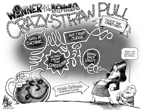
Mike Ritter, art director for the GA Voice, died shortly after midnight on Sunday, March 30, 2014. He was 48.
Mike, far right with Garry Trudeau during the 2004 AAEC Convention in Lexington KY. Photo: Brian Fairrington
He was admitted into the emergency room at Atlanta Medical Center on Friday, March 28, where doctors determined he had a dissection on his aorta, a very severe condition. After undergoing a 10-hour surgery on Saturday, he died due to the severity of his condition and complications from undergoing open-heart surgery.
He was the editorial cartoonist at the Tribune in Phoenix from 1992-2005 and a syndicated cartoonist with King Features Syndicate.
Ritter was honored by the Suburban Newspapers of America while at the Tribune and was awarded first place for editorial cartooning by the Arizona Press Club in 1993, 1995 and 1996.
In 1999 he received the Thomson newspaper chain’s highest award for illustration and a Freedom of Information Award from the Arizona Newspaper Association.
In 2004 he was profiled by Editor & Publisher magazine where he was also noted for being an openly gay staff cartoonist at a mainstream daily newspaper.
After Ritter moved to Atlanta, he joined the staff of the former Southern Voice where he was a graphic designer and cartoonist. He also was a cartoonist for GA Voice and worked for the Atlanta Journal-Constitution before joining the GA Voice staff as full-time art director last year. In 2011 as cartoonist for the GA Voice, he won third place for Best Original Editorial Cartoon in the National Newspaper Association’s Better Newspaper contest. The cartoon was a biting look at the Atlanta Police Department’s raid on the Atlanta Eagle after news broke that that the lead investigator of the raid was arrested for driving under the influence of alcohol and marijuana.
No drugs were found during the raid of the Eagle in 2009.
Many of his GA Voice and SoVo cartoons were picked up by other LGBT media outlets and blogs.
“Mike was a dear friend, a great person. He made me laugh. He made me think. He made me a better person and a better editor. He had an encyclopedic knowledge of old music and old movies. A true Renaissance man,” said Dyana Bagby, GA Voice editor. “He kept his great sense of humor until the very end even though he was in pain and uncomfortable. We at the GA Voice are heartbroken.”
Ritter’s impact goes far beyond his cartoons and graphic design, agreed Laura Douglas-Brown, GA Voice co-founder and former editor.
“I could talk about Mike’s brilliance, his skill as a cartoonist and illustrator, his keen political wit — but this would barely touch the surface of who Mike was to so many,” Douglas-Brown said. “There simply are no words big enough for the man he was or the legacy he leaves behind.”
His best friends, Will Alford and Tim Messier, are in contact with the family and plans for a memorial will be announced as soon as more information is made available.
Ritter’s Facebook page has become a memorial tribute page from so many people who love him.
The National Cartoonist Society has announced the line-up of speakers for the upcoming Reuben Awards weekend. Also announced is a return of the NCS A.C.E. Award (Amateur Cartoonist Extraordinaire) given to a notable individual who aspired to be a cartoonist but became famous by other means. This year’s A.C.E. recipient is “Weird Al” Yankovic. Past recipients include: Carol Burnett, Jonathan Winters, Jackie Gleason, Orson Bean, Ginger Rogers, Al Roker, Denis Leary and Morley Safer.
Here’s the run-down on the speakers as posted on the NCS website: Eddie Pittman- Animator, illustrator, creator of the online graphic novel Red’s Planet Chris Houghton- Animator, comic artist, illustrator, 2009 winner of the NCSF Jay Kennedy Memorial Scholarship Greg Evans- 2003 Reuben Award winning creator of the syndicated comic strip Luann. Suzy Spafford- Creator of Suzy’s Zoo, greeting card/product/licensing entrepenuer Sandra Bell-Lundy- Creator of the syndicated comic strip Between Friends, which is celebrating 20 years in syndication. Bunny Hoest Carpenter and John Reiner- Recipients of the 2014 NCS Gold Key Award (The NCS Hall of Fame), creative team on the syndicated panel cartoon The Lockhorns Russ Heath- Comics legend and recipient of the 2014 NCS Milton Caniff Lifetime Achievement Award
It also mentions that Tom Gammill will return as the host of the Reuben Awards show.
The Reuben Awards will be held in San Diego, CA this year over Memorial Day weekend (May 23rd-25th).
The winners will be announced Saturday, May 24th at the annual NCS Reuben Awards dinner in San Diego, CA.
The finalists in the other categories:
Newspaper Illustration
Bob Eckstein
• Miel Prudencio Ma • Dave Whamond
Feature Animation
• Mike Giamo: Production Design “Frozen”- Disney • Hayao Miyazaki: Director, “The Wind Rises”- Disney • Jonathan del Val: Animator of Lucy character, “Despicable Me 2″- Illumination
TV Animation
• Craig McCracken for “Wander Over Yonder” – Disney • Paul Rudish for Disney Channel’s “Mickey Mouse” shorts – Disney • Douglas Sloan & Art Edler Brown for “Dragons: Riders of Berk” – Dreamworks
Newspaper Panels
• Dave Coverly • Scott Hilburn • Mark Parisi
Magazine Gag Cartoons
• Matt Diffee
• Bob Eckstein • Mike Twohy
Advertising/Product Illustration
• Cedric Hohnstadt • Sean Parkes • Rich Powell
Greeting Cards
• Glenn McCoy • Mark Parisi • George Schill
Comic Books
• Sergio Aragonès – Sergio Aragonès Funnies • Jay Fosgitt – Bodie Troll • Chris Samnee – Daredevil
Graphic Novel
• Dan E Burr- On The Ropes • Rick Geary – Madison Square Tragedy • Andrew C Robinson- The 5th Beatle
Magazine Illustration
• Daryll Collins • Anton Emdin
Dave Whamond
Online – Long Form
• Jenn Manley Lee – Dicebox • Dylan Meconis – Family Man • Eddie Pittman – Red’s Planet • Jeff Smith – Tuki
Online – Short Form
• Jim Horwitz – Watson • Ryan Pagelow – Buni • Mike Twohy – New Yorker Online
Book Illustration
Matt Davies
• William Joyce • CF Payne
Newspaper Comic Strips
• Issabella Bannerman – Six Chicks • Teri Leibenson – Pajama Diaries • Mark Tatulli – Lio
Philadelphia Daily News and Inquirer editorial cartoonist Signe Wilkinson was among several individuals connected to the Philadelphia newspapers named in a defamation suit filed by Pennsylvania Supreme Court Justice Seamus McCaffery and his wife Lise Rapaport who allege the paper conducted a smear campaign. The suit mentions a specific Signe cartoon satirizing the couple.
Philadelphia magazine has a write-up on the background of the case. I’m not even going to try to sum it up (a lot of local politics). On the face of it, I can’t think of a case (nor can I find one online) where a cartoonist has been successfully found guilty of defamation in the US. Most cases I’ve heard about are quickly tossed out. In this case, it’s the reporting of the paper that is in question and not specifically Signe, so I’m not sure how that changes the dynamics of the case as far as Signe is concerned.
Photographer Anja Niedringhaus in Rome in 2005. Photograph: Peter Dejong/AP
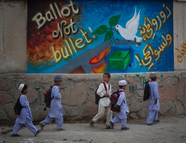
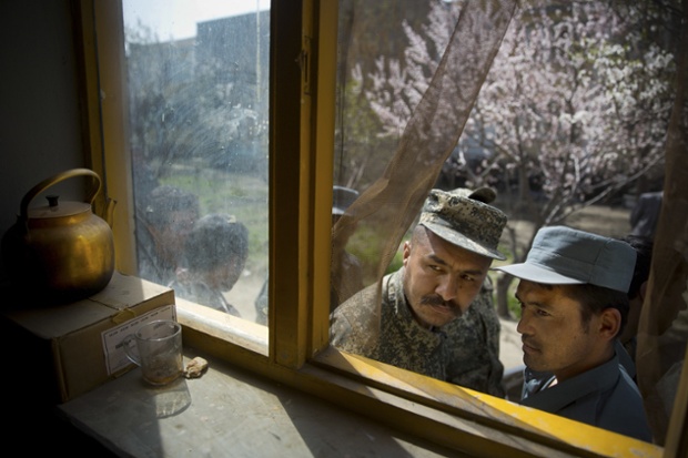
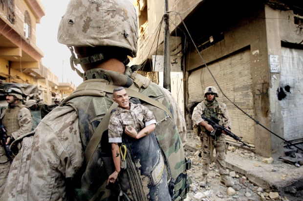
Pulitzer prize-winning photographer Anja Niedringhaus has been shot dead in Afghanistan's violent east while covering preparations for the presidential election. A frequent contributor to the Guardian, here is a retrospective of her work, from the war zones of Iraq and Afghanistan to the London 2012 Olympics.
Afghan police secure the area as presidential candidate Ashraf Ghani Ahmadza arrived for a campaign rally at a stadium in Kabul on 1 April 2014
Schoolchildren walk past election graffiti on their way home on the outskirts of Kandahar
An Afghan soldier and a police officer peek through a window as they queue outside a school in Kabul on the last day of voter registration for the elections
A woman holds her baby in April 2013 as she waits to try on a new burqa in a shop in the old town of Kabul
A vendor prepares balloons to sell for Valentine's Day in Islamabad, Pakistan, in February 2012
This photograph of a US marine carrying a lucky mascot as his unit pushes further into the western part of Fallujah won a Pulitzer prize in breaking news photography as part of a series of pictures of bloody combat in Iraq in 2004
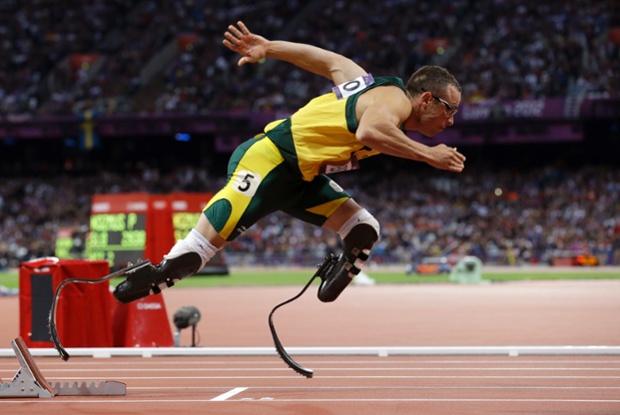
South Africa's Oscar Pistorius competes in the men's 400-metre athletics semi-final in the Olympic Stadium at the 2012 London Games
The documentary Stripped, which covers the past, present and future of comic strips, looking at how they are affected by the digital age, has been released on iTunes.
There’s more at Boingboing, which gives it a thumbs up. And the creators of the film discuss the survival of strips in a Q&A here.
Given that you're reading this page, you probably already know all about Adrian Raeside. He has had a lock on a chunk of real estate near the top of the page since we started buying his cartoons three and a half decades ago. Odds are, you're a fan.
And through the years, through 10,000 or so cartoons, he has come up with some good ones. The best of the best have been collected into a book that hit the stores this week.
For full disclosure, I should note that Adrian is not only a colleague, he's also a friend. As a result, this column falls somewhere between a valuable reader service and a shameless plug.
The new book is entitled The Best of Adrian Raeside: A Treasury of B.C. Cartoons. It is a collection of about 230 examples of his work published between 1989 and 2014.
Raeside has been with us since 1979, a decade earlier than the earliest toon in this book, which makes me think that perhaps his work in the first 10 years was not very good. He disagrees with that, saying that he just couldn't find the early originals. Whatever.
Raeside's career as a cartoonist began when Don Vipond, the editorial page editor at the old Daily Colonist, took a chance on a raw, untested artist from Saltspring Island.
Thirty-five years ago, we didn't have goodies such as scanners and email accounts. Every time Raeside drew a cartoon, he would have to drive it to the Times Colonist office. We paid him for each cartoon, but these payments didn't cover the cost of the gas and the ferry, let alone the ink and drawing boards.
For some reason - perhaps his math skills were weak - he stayed with us. He survived the merger of the Colonist with the Victoria Times in 1980, and then a succession of editors, publishers and owners.
As the years passed, his work improved, and we started paying him enough to cover his costs. Today, he is the grand old man of cartooning in Western Canada, and his influence is huge.
I asked him the obvious question. He told me that it wasn't easy coming up with the list of his best.
"I was faced with thousands of cartoons and it was tough to know which ones would make it, as I'm a lousy judge of what's funny," he said. "Cartoons I think will be a hit, flop. And ones I think will flop, get tons of mail, although not all writers are fans."
His book includes a running commentary as a reminder of the events that inspired the cartoons. That helps, because it can be hard to remember all of the twists and turns in B.C. politics.
"Some, like those in the chapter on our unique B.C. lifestyle, really didn't need explanation, but as I was being paid by the word, I added commentary anyway," he told me. I hope the people at Harbour Publishing don't read this.
Raeside's personal list of favourite cartoons might surprise you. He says his favourites are the ones with interesting angles or details.
"Not many readers would say: 'You should have seen the way he drew Harcourt's head,' but I always felt the drawing is half the cartoon," he said.
True enough - but if the gag is lame or the idea misses its mark, no amount of dressing up a cartoon with squiggly lines will save it. That's something all cartoonists have to figure out if they want their careers to be long. At 35 years and counting, it's safe to say that Raeside gets it.
His best guess is that this is his 15th book - again, he's not a math major - and it follows gems such as No Sailing Waits and Other Ferry Tales, Tales Don't Lie: A Decade of Dog Cartoons and Return to Antarctica, on the 1910 Scott expedition to the South Pole.
The Best of Adrian Raeside might turn out to be the most popular of the lot. But remember - as a dedicated follower of this page, you had a sneak peek!
The Best of Adrian Raeside: A Treasury of B.C. Cartoons
Harbour Publishing
ISBN 13: 978-1-55017-631-5 ISBN 10: 1-55017-631-5 Price: $12.95 CAD; $12.95 USD Paperback 200+ B&W cartoons 8 x 8 - 192 pp April 2014
Book Description
For over three decades editorial cartoonist and BC resident Adrian Raeside has trained his laser wit on a subject he knows well—the foibles of life on Canada’s wet coast. From yoga devotees to redneck fishermen, political potheads to bloated bureaucrats, plus provincial pet peeves like leaky condos,ICBC premiums and smart meters, no stone is left unturned, particularly when it comes to the politically slanted stereotypes of Left Coasters.
Hot topics such as the Northern Gateway pipeline, carbon taxes and the hidden perils of electric cars are pondered alongside the subtle difference between Saskatchewan’s wheat harvest and BC’s second-largest industry: cannabis production. Addressing often-touchy issues with his clever and amusing West Coast characters and critters, Raeside casts his spotlight on bear awareness programs and the current role of conservation officers, the increase of wildlife-human encounters (at your local watering hole) and the lack thereof (at wilderness retreats).
This compilation of Raeside’s most hilarious cartoons is sure to tickle the funny bone of anyone familiar with ‘Super, Natural British Columbia’ and the lifestyles of those who live there.
MK Brown isn’t just the really good, uniquely gifted cartoonist who occasionally contributed to Wimmen’s Comix, the one who had her character Dr. Janice N!Godatu animated on The Tracey Ullman Show in the late ’80s, though prior to reading this book, that’s mostly how I knew of her. But Brown’s work has been in print in all sorts of publications, including wide-circulation venues like The New Yorker, National Lampoon, and Mother Jones, as well as in legendary underground comix like Arcade and Young Lust.
Fantagraphics, continuing their series of books devoted to cartoonists whose work had yet to be comprehensively collected (like Diane Noomin’s Glitz-2-Go), now gives us this retrospective of Brown’s work, culling forty-three years of comics and panels into one volume at long last.
The book comes with a foreword from cartooning legend Bill Griffith and an afterword from the equally legendary Roz Chast. It’s easy to understand why they champion her work. Brown’s career has been a bit of an anomaly. Even with that impressive resume under her belt, Brown — like Griffith, like Chast — is possessed of a highly idiosyncratic, cerebral-slapstick sense of humor. She is definitely Her Own Thing. Chast notes that Brown draws and writes for herself, first and foremost drawing what is funny to her personally. While some of her private jokes go no further, most connect in a delightfully loony fashion, looking at modern life as they do through a very warped lens.
Brown’s skill at rendering human grotesques is on a par with masters like Gahan Wilson and Bill Plympton; though her figures seem basically benign, they also have a creepily lifelike quality that belies their cartooniness. Her best comics pop in a perfectly rendered mixture of understated drollery with farcical stoopidity, with the action and characters twisting, swooping, spilling, and slanting across her pages. Her “White Girl” strips are a perfect case in point. White Girl’s expression never changes from the blandly polite, suburban middle class grin frozen on her face, though her body can and does contort itself into ridiculous positions. In such “stories” (they’re really basically comic riffs) as “Let’s Do the White Girl Twist (Like We Did Last Summer)” and “White Girl Sings the Blues (Get Down)” the supremely Anglo White Girl does indeed get down and funky and never looks less than hilarious doing so.
Brown reveals a more serious side to White Girl in the masterful twelve-page “White Girl Dreams”, where White Girl has bizarre flights of fancy, imagining among other things, “soaring with others in the night, dancing though my face is someone else’s.” In it, Brown blends middle class ennui with surrealist tropes to create an ultimately rather poignant, fragmented portrait of a day-to-day existence suffocated by rules, traditions, and obligations, where the good, pleasurable flights of fancy are shunted off to some forgotten, subterranean part of the brain. White Girl yearns for those good dreams, telling us, “I always get the other kind.” The other kind are the ones in which an annoying “perfect stranger” comes home and regales her with endless obnoxious, husband-to-subservient-wife questions (“What’s for dinner? When do we? Why aren’t there any?” and so forth). She also tells us, understandably, “I hate this dream.” Without making any fuss, a feminist viewpoint clearly surfaces throughout the swirl of fantastical, kaleidoscopic imagery. It may indeed be that the dream White Girl hates is her actual life, a take that gives the piece its particular edge. Exploring the very nature of dreams vs. reality and what one makes of the difference, the story rewards multiple readings.
Another memorable tale, the all-color five-part “Another True Life Western Romance”, hilariously satirizes the “simple frontier life” trope. The star is Lolly Barrows (Brown’s best stories are female-driven), who endures multiple travails: a missing husband (he’s been stolen by Indians), her overbearing adopted parents, Cecil and May, and their baby, Amando. Later, while awaiting her husband’s return, she gives birth to three creepy-looking triplets, and helps out a hunky stranger, Mr. Cockburn, who appears to be a prime romantic prospect. Until Lolly’s husband returns home, of course. Things escalate from there. Brown takes what could be an overblown Old West-cum-Douglas Sirk melodrama and spins it into a zestily drawn, loopy satire, topping it off with a happy/absurd ending for poor put-upon Lolly. Again, Brown reveals a feminist bent underneath all the zany comedy but she’s having way too much fun to push a more didactic approach – it’s just not her style.
Although the book is generally consistent and Brown demonstrates a brisk versatility in a range of comics formats, there are certain pieces that don’t come off, bits of whimsy that seem half-baked – particularly some of her single panels. One gag involving a Publishers Clearing House notice reads like some metaphors got mixed up; others remain odd little riffs that simply score low on the laff-o-meter or just don’t tap the right brain synapses with me. As Brown herself states in her introduction: “Cartooning also contains the lunacy component, which maintains that if one person (oneself) can see the humor or truth or strangeness in something (thus the value in drawing it), others will too, and if they don’t, well, we can’t help that.” It’s all quite subjective and subversive, and Brown is the kind of artist who actually makes you think seriously about this subjectivity while reading her comics. There may even be some readers out there who won’t see the amazingness of her White Girl comics or various single panels involving monitor lizards at a barbecue or rooms painted “a lot yellower” than expected, though I think they are probably beyond help.
Though attractively produced and presented the book is indifferently annotated, so unless Brown specifically states in her chapter intros where certain comics were originally published, we are not given information as to what ran where or when it was drawn (she’s sporadic about dating her work). The closet librarian in me balks at this omission of information, the same way it balks at books that don’t include pagination (not the case here, happily). These are my personal Dreams of Everything Being in its Place, a neat and orderly universe. Perhaps White Girl would sympathize. Perhaps not.
In the end, MK Brown, a true original, deserves this fine compendium, as do her fans. It is work that I cannot imagine being mistaken for that of any other cartoonist—and I mean that in the best sense. I advise reading it a little at a time, for maximum results. Her bizarre, view-askew universe can make you laugh while simultaneously altering your consciousness—just a little bit, in just the right way— should you let her take you along for the ride.
Stranger Than Life: Cartoons and Comics 1970-2013 MK Brown Fantagraphics $35.00, 248 pages
You know the saying: You can’t judge a book by its cover. With magazines, it’s pretty much the opposite. The cover of a magazine is the unified identity for a whole host of ideas, authors, and designers who have created the eclectic array of stories and articles and materials within each issue. And, some would argue, this identity extends to the reader as well. If you’re seen with an issue of Vogue, you don’t just own that copy—you become a Vogue reader. Magazine covers are a challenge to design, since they have to be both ever-changing and also consistently recognizable. For this reason, most publications stick to a standard set of practices.
This is the anatomy of a magazine cover, starting from the top. Literally.
The most obvious example is that the name of the publication is always plastered across the top, so that you can identify the brand from the get-go.
After the brand name, the second objective is to relay the new-ness of the latest issue. Magazines want to be sure that readers know that they don’t have this particular issue yet. There are a few ways to do this, but a good method is to use different colors month to month. Even if the covers look pretty much the same otherwise.
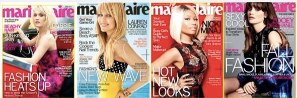
Marie Claire magazine covers, June, July, August, and September 2013.
Then the photograph. The photograph aims to connect with the reader through eye contact and a recognizable celebrity face. But the photograph wasn’t always part of the equation.
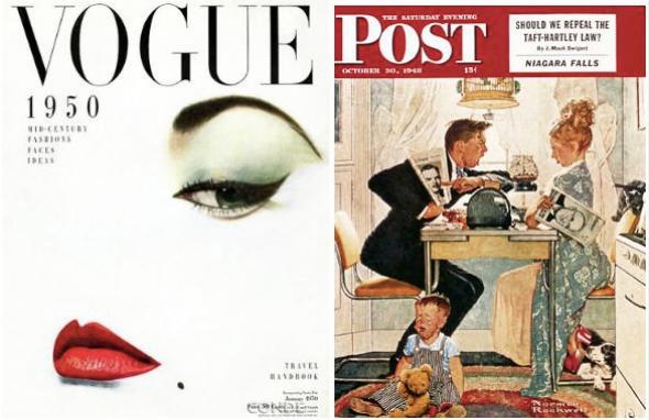
Early magazine covers were essentially illustrated.
Vogue, January 1950; The Saturday Evening Post, October 1948.
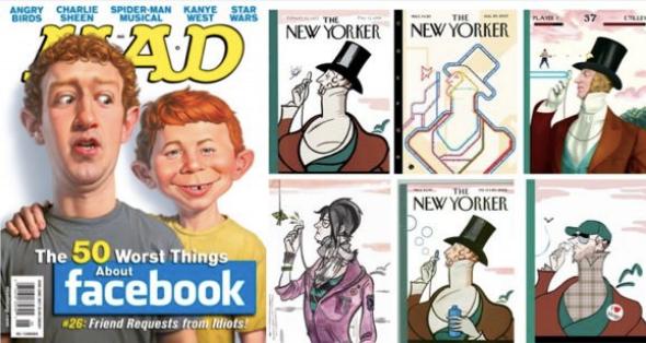
And these illustrated covers usually did not feature celebrities. They were mostly scenes from fantasy or everyday life, or they featured the publication’s illustrated mascot. Some of these characters persist today, like the Playboy bunny, Mad's Alfred E. Neuman, and The New Yorker's monocled Eustace Tilley.
Mad magazine, June 2011; Variations of The New Yorker's Eustace Tilley.
Even U.K. Vogue had an illustrated mascot—Ms. Exeter, an elegant 50-something woman who had an advice column about being a classy, classy dame.
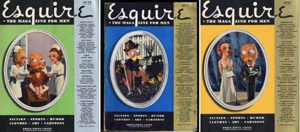
And Esquire had Esky, a mustachioed skirt-chaser.
Esquire, June 1948, May 1935, May 1934.
A lot of Esquire covers featured Esky. That is, until George Lois came along.
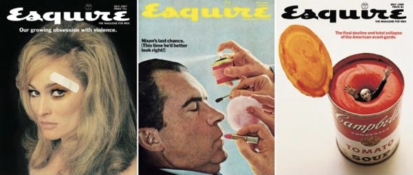
George Lois revolutionized the cover of Esquire, using big, bold, eye-catching photographs. You’ve probably seen some of these covers, or at least homages to them.
Esquire, July 1967, May 1968, May 1969.
The crazy thing was that Lois didn’t even work for Esquire. He was an ad man. He did commercial work.
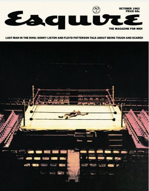
In 1962, Harold Hayes, the newly hired head editor of Esquire, asked Lois to do a cover for him. As Lois tells it, Hayes was desperate and needed a cover in three days. Hayes gave Lois a description of 20 contents in the upcoming issue, including a spread of Floyd Patterson and Sonny Liston, who were about to go head to head in the upcoming heavyweight fight. Everyone was predicting that Patterson would win, and the magazine was going to be released before the fight.
Three days later, Lois delivered a cover of a Floyd Patterson doppelgänger laying flat on his back, dead in the ring. The message was clear: Esquire was calling the fight for Liston.
Esquire, October 1962.
So there was a good chance that Esquire would be wrong, which would be completely embarrassing. But Harold Hayes let Lois go with it. And Lois actually got it right.
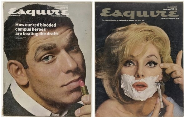
Lois went on to create 92 Esquire covers over the next 19 years, most of them just as eye-catching and controversial as his first. Many were one big stark image, with little or no text. They almost look like wall posters, and now many of them are in the permanent collection of the Museum of Modern Art in New York.
Esquire, September 1966, March 1965.
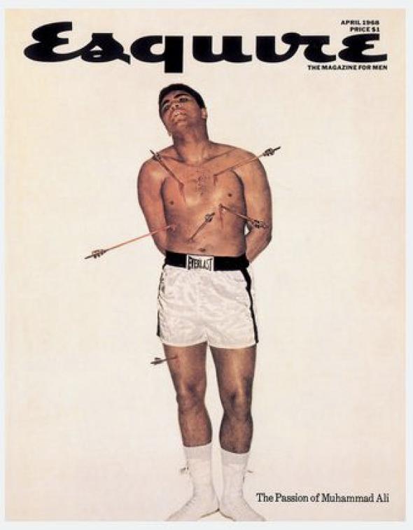
If you’ve seen any of Lois’ covers, or variations of his covers, it’s probably his photograph of Muhammad Ali, which is sometimes cited as the greatest magazine cover of all time. The cover is almost completely white, with Muhammad Ali, shirtless, pierced all over his body with arrows. Like a martyr.
Esquire, April 1968.
Ali had refused military service, claiming conscientious objector status through his conversion to Islam. Ali was sentenced to jail, stripped of all his titles, and condemned as a draft dodger—some even called him a traitor. The idea of this cover was to suggest that he was a martyr to his religion, but George Lois chose a Christian martyr to represent him—specifically, St. Sebastian.
Ali called up Nation of Islam leader Elijah Muhammad and explained the painting on which this photo was based in excruciating detail, before finally putting George Lois on the phone. After a lengthy theological discussion, Elijah Muhammad gave George Lois his OK.
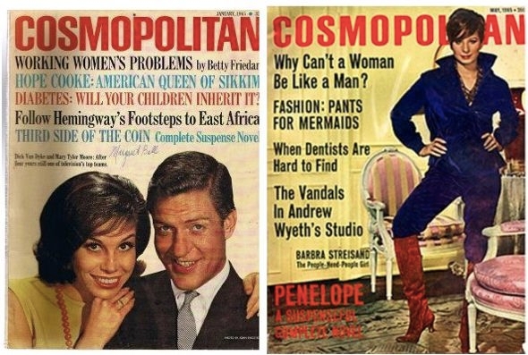
So Lois helped make photographs more or less standard on magazine covers. Then, in 1965, Cosmopolitan ushered in the era of the cover lines, aka words.
Cosmopolitan, January 1965, May 1965.
Cosmopolitan wasn’t the first to use text on the cover, but it was the first to use it really provocatively, and it set the standard template for what a newsstand magazine looks like today. Covers started to frame their photographs with words, creating a sort of “doughnut” of text around the featured image.
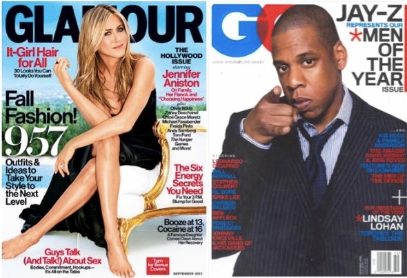
Glamour, September 2013; GQ, December 2006.
Even though magazines are covered in words, there’s tremendous debate among editors and art directors as to how to maximize the value of the key pieces of real estate on a magazine front cover. These key pieces of real estate vary depending on the kind of magazine.
Celebrity weeklies always have their big coverline across the middle of the magazine. And it’s almost always written in yellow, since it pops on the newsstand. The whole weekly market relies on yellow.
Star; OK!; Life&Style; Us; In Touch.
For the more lifestyle-oriented magazines, the most captivating cover lines go in what’s called the hotspot, located immediately underneath the logo on the left. Unless it’s on the right. Magazines are racked differently in different countries, and racking patterns often shape page layout.
In the U.K., a lot of the magazines are shuffled with their left edges overlaying each other, with only the left edge revealed. So in England you get most of your headlines on the left side, or “the leading left edge.”
In the United States, magazines are racked in a waterfall presentation, where you see the top third, so our publications stick their best cover lines high and close to the logo on either side.
U.S. publications have many more coverlines than those in the U.K. Purely because of the way they’re stacked up for retail.
U.K. Vogue, November 2011; U.S. Vogue, April 2011.
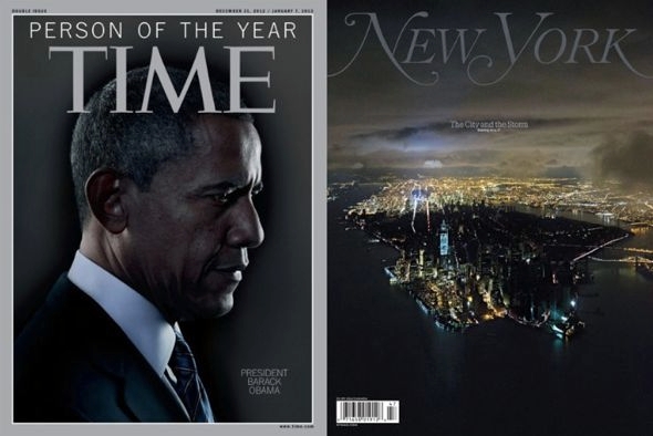
Magazines that don’t rely on newsstand sales look very different from magazines that do. Titles like the Atlantic, Time, and The New Yorker have the luxury of not needing to grab someone’s attention at the checkout line.
These are a little more Lois-esque, with big photographs and pictures and not as much text.
Time, Dec. 31, 2012-Jan. 7, 2013; New York, Nov. 4, 2012.
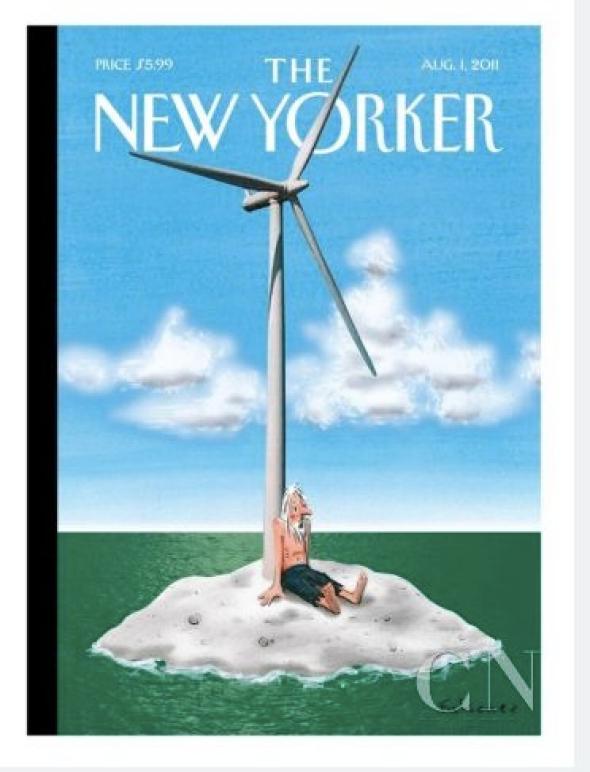
The New Yorker even reverts back to the pre-1960s illustration model for subscribers:
The New Yorker, Aug. 1, 2011.
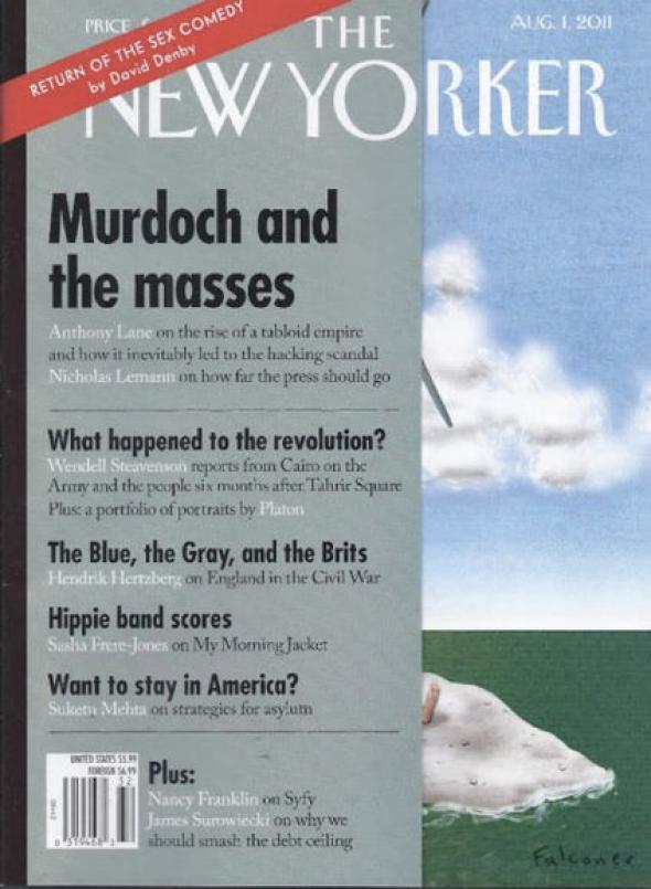
When you encounter The New Yorker on the newsstand, there’s a little flap on the leading left edge with a list of contents.
The New Yorker, Aug. 1, 2011.
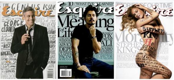
Big pictures by themselves just don’t sell like they used to. It’s about volume of content. Magazines are expensive on newsstands, and readers want to be reassured that there’s plenty to read inside. Hence the illegible cornucopia of headlines on Esquire today.
Esquire, December 2006, January 2008, July 2009.
This is the work of David Curcurito, current design director at Esquire. Curcurito’s style is so overloaded with words that it explodes the “doughnut.” The text is not just about communicating what information is in the issue, but showing you that there’s a lot of it.
The text and the image weave in and out of each other in such a way that the words almost act like an image. This is Esquire’s way of standing out from all the other magazines on the rack. But it doesn't stand out in the same way Lois’ covers did. Curcurito has messed with the standard magazine formula, but he tends to stick to it. Because this formula works. And it has been working for a long time.
But fear not, art directors everywhere, George Lois has a simple solution: mimic his covers.
Innovative newspaper ads are a rare beast. We've seen a few fun ones lately—the Game of Thrones ad with the dragon shadow; the ad for the movie The Book Thief with two almost completely blank pages.
Here's an interesting one from Colombia. It's an ad for kitchens hidden inside a fake classifieds page—thanks to a nifty 3-D effect applied to the text. "The kitchen you are imagining is in HiperCentro Corona," says the headline. You can argue about how effective it might be. Is it too subtle? But it's conceptually strong (it's a great way to illustrate something that could be on your mind while idly reading a newspaper) and executed well, too. Plus, here we are talking about a newspaper ad from Colombia. How often does that happen?
Last month marked the third anniversary of the earthquake and tsunami that caused the nuclear disaster at Fukushima, Japan. The nuclear fallout from Fukushima is ongoing—in addition to leaking radiation into the air, 1000s of tons of highly radioactive water continue to leak into the ground and into the Pacific Ocean. The worst leak in the last 6 months took place just last month, in February 2014, when about 100 tons of radioactive water leaked. This affects us all –the air we breathe, the fish we eat, and things we don’t even consider. Just days ago, snow falling in Missouri was found to contain double the normal radiation amount. The FDA stopped testing fish in the Pacific Ocean for radiation not long after the disaster started, but independent research is showing that every Bluefin tuna tested in the waters off California has been contaminated with radiation that originated in Fukushima. Scientists suspect that all fish in the Pacific Ocean are affected.
Yossi Lemel’s poster connects the 2011 nuclear disaster with the 1945 dropping of the atomic bomb on Hiroshima. His title is from the 1959 French film "Hiroshima Mon Amour" which, among many other things, is about war, memory, and forgetfulness. We must not forget.
Fukushima Mon Amour Yossi Lemel Offset, ca 2012 Tel Aviv, Israel
He’s something like a soothsayer and a weather vane, pundit and funnyman all rolled into one.
On Monday, longtime Salt Lake Tribune cartoonist Pat Bagley was recognized as a finalist in editorial cartooning for the Pulitzer Prize. For the past 36 years, Bagley has been skewering the powerful and intemperate, while bringing wry smiles to Tribune readers of all stripes.
The Pulitzer went to Kevin Siers of the Charlotte Observer. David Horsey of the Los Angeles Times also was a finalist.
Bagley’s work stood out, according to the contest judges, "for his adroit use of images and words that cut to the core of often emotional issues for his readership."
The 58-year-old Bagley has drawn more than 10,000 cartoons for The Tribune.
"I wake up in the morning and I’m grateful I get to do this, because I love my job," he said Monday. "Every day is a high-wire act. Some days I get the idea [for a cartoon] early. Other days I’m pushing deadline. It’s different every single day."
Bagley often takes aim at Utah politicians. And since the state Legislature is dominated by Republicans, they usually catch his flak.
That’s perfectly OK with state Sen. Jim Dabakis, D-Salt Lake City.
"Pat Bagley is on a par with Delicate Arch and Zion [National Park] as a Utah treasure," he said. "Pat can take 10,000 words on 10 hours of debate and sum it up with five words and a few sketches and be completely accurate. It’s genius."
Across the aisle, conservative state Sen. Curt Bramble, R-Provo, gets a kick out of Bagley’s work, too, even when he’s on the receiving end.
Bagley "is creative, funny and sometimes edgy," Bramble said, noting that the cartoonist leans to the political left. "If I can’t laugh at myself, I shouldn’t be here."
Although many Utahns can’t wait for the annual 45-day state legislative session to end, Bagley savors it.
"When the Legislature is in session, being a cartoonist is the easiest job in the world," he said. "They write the material for me."
Bagley was born in Utah but grew up in California and comes from a long line of Utah Mormons.
Nonetheless, a frequent target of his pen is The Church of Jesus Christ of Latter-day Saints.
A recent cartoon had two men looking out a widow in the Church Office Building staring down at the Salt Lake LDS Temple with the Utah Capitol in the background. One remarked to the other: "Do other religions have their very own Legislatures?"
"I’m not hostile to the church," Bagley said. "But they are a huge presence — they are the 800-pound gorilla [in Utah]. I wouldn’t be doing my job if it didn’t [include them].
Bagley’s Pulitzer entry featured cartoons on the tea party, the Taliban, former Utah Attorney General John Swallow and U.S. Sens. Harry Reid, D-Nev., and Mitch McConnell, R-Ky., among others.
Another politician who has been on the receiving end of Bagley’s rapier wit is U.S. Sen. Orrin Hatch, R-Utah, who, nonetheless, praised the cartoonist.
"Pat has a natural feel for the vagaries and unique culture of politics," he said. "No one has had more fun lampooning me than Pat. Despite the pain, I really enjoy his talent."
In the late 1970s, Bagley began cartooning at the Daily Universe, the student newspaper at Brigham Young University.
"I used to be fairly apolitical" he said of the Ronald Reagan, George H.W. Bush and Bill Clinton years. "But George W. Bush radicalized me. It was Republicans finally getting their Shangri-La," he said. "They got their fantasy world: cutting taxes, cutting regulations and throwing their weight around. And it all ended in tears."
Tribune Managing Editor Lisa Carricaburu said Bagley’s skill as a political cartoonist has made him an institution in the community.
The newspaper is "pleased he’s getting the national recognition he deserves," she said. "He is one of many people we are fortunate to have working at The Salt Lake Tribune who make the paper vital to Salt Lake City and Utah."
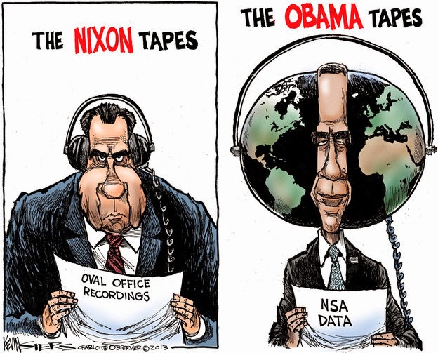
Editorial cartoonist Kevin Siers, who for the past quarter century has skewered political egos across the Carolinas with the soft tip of a paintbrush, was awarded the Pulitzer Prize Monday.
Siers, 59, is the third Charlotte Observer cartoonist to receive journalism’s highest honor. His award brings to five the number of Pulitzers won by the newspaper.
“And last week, I won a fishing contest, too,” Siers quipped to colleagues gathered in the newsroom when the award was announced.
“I always tease him because I tell him he’s not only so clever about what he does, he can draw well, too,” said Observer publisher Ann Caulkins, who, along with the staff, toasted Siers with champagne served in plastic cups.
Observer editor Rick Thames called Siers one of Charlotte’s enviable civic distinctions.
“Every day, Kevin lifts us above the contradictions in public life and calls out what really matters,” said Thames. “He tweaks and pokes and, most importantly, says flat-out what others would have us try to read between the lines. As a bonus, we get to laugh and cry together.”
Born to draw
As a child growing up in the rural Minnesota iron range about 60 miles north of Duluth, Siers (pronounced “Sires”) began drawing before he could spell. He would sketch cartoons, then draw gibberish in the bubbles he’d provided for the dialogue.
Siers improved his skills by imitating the style of newspaper comic strips such as “Pogo” and “Dick Tracy.” By the fourth grade, he was copying the intricate fantasy artwork of Marvel Comics’ “Spider-Man” and “Fantastic Four.”
“I imitated everybody,” Siers said. “I stole left and right. Eventually, I came up with my own style.”
As a teenager, he spent the northern Minnesota summers fishing, hunting and hiking, then after high school followed his father, a mechanic, into the ore-mining trade. “That’s what everyone did up there,” he said. “They’d strip mine the ore, process and manufacture it, then ship it out on the Great Lakes to Pittsburgh.”
He started as a laborer and worked his way up in the mining hierarchy. It was well-paying work, and whenever he’d saved up enough, he’d take classes at the University of Minnesota in Minneapolis as a biology major, then return to the mines or other jobs to earn more.
Starting out small
During one layoff at the mine, he submitted cartoons and got them published in the local weekly, The Biwabik Times. They went on to win a prize from the Minnesota Press Association.
“So I said, ‘I guess I could do this,’ ” Siers said.
When he returned to the university, he began doing editorial cartoons for the campus newspaper, the Minnesota Daily. He got to know Steve Sack, political cartoonist for the Minneapolis Star Tribune and last year’s Pulitzer winner for editorial cartoons.
“Sack was my mentor,” Siers said. “He’d take me out to lunch and show me grown-up cartoonist tricks.”
A dreadful gig
After years of on-again, off-again enrollment, Siers finished at Minnesota in 1987. He did freelance art work, which led to what he remembers as his most dreadful assignment.
He was hired to fly to Orlando and draw caricatures of executives attending a banking convention. But the executives didn’t want caricatures and sent their wives instead.
“So I was drawing caricatures of middle-aged women. That was really uncomfortable. I didn’t know how to pretty them up. I wasn’t that good an artist yet. I was squirming, they were squirming. So, I guess I got used to making people uncomfortable there.”
A job in the Carolinas
In the autumn of 1987 at age 33, Siers landed a job at The Charlotte Observer, replacing cartoonist Doug Marlette, who had left for The Atlanta Constitution.
In the 26 years since, Siers has sketched five presidents, eight Charlotte mayors (four in the last year) and served under three Observer publishers.
He starts each morning by studying the newspaper to get ideas. He then attends the morning editorial board meeting, where topics are discussed for the Observer’s opinion page.
“Artistry is only part of his skill,” said editorial page editor Taylor Batten.
“He’s first and foremost a journalist who has a passion about current events and public affairs. He is so plugged into what’s going on, he’s able to use that base of knowledge to inform through his cartoons.”
Batten said the portfolio of 20 cartoons on national topics submitted to the Pulitzer jurors was typical of Siers’ range as an “equal opportunity” satirist of politicians on both sides of the aisle. President Barack Obama is a frequent target.
Thinking, drawing, coloring
Siers’ workdays are split into three phases. First is mining the spark of an idea. He spends a few hours scribbling at his desk, playing with ideas, which jell into a sketch by midday.
Siers is under no obligation to follow the editorial board’s opinion in his cartoon and occasionally takes contradictory positions.
“Sometimes we’ll be discussing what we’re going to do,” said Caulkins, the Observer’s publisher, “and Kevin is saying, ‘I have a different take on that.’ He is his own person. We embrace that.”
Siers is rare among modern professional artists by his choice of his tools: A watercolor brush and fine-point pen. Most of his breed have long since adopted the computer screen as their canvas.
“I dip the watercolor brush in India ink and the brush is responsive,” he said. “You push down and get a thick line. You ease up and you get a fine line. I’ve thought about using the computer, but I just love the physical feel of pushing against the paper. It’s very hard to let that go.”
Afterward, he scans the finished cartoon into the computer, and uses a Photoshop program to colorize it. He sends copies of cartoons on national issues to King Features Syndicate, which distributes them to clients across the country.
Hitting the target
To succeed, an editorial cartoon must be simple, even while conveying a complicated message. Its elements must click emotionally with the reader, and the best elicit either a laugh or an “ouch.”
“Kevin is able to say as much in a cartoon as anyone can say in a 700-word editorial,” Batten said.
Caulkins said she routinely gets feedback, positive and negative, on Siers’ work. A talented editorial cartoonist, she said, should attract a range of reactions.
Some of Siers’ artistic victims are, surprisingly, enamored of his work. Former county manager Harry Jones, the late Sen. Jesse Helms, and county commissioner Bill James are among those who have requested and received originals of cartoons in which they have been lanced by Siers.
“Jesse used to have a wall of editorial cartoons about him in his office,” said Siers. “He used them to raise campaign contributions – he’d say, ‘See what they’re doing to me. Send money!’ ”
A quiet presence
Attached to the Pulitzer are two obligations. First is to accept the $10,000 prize check, and the second is to bask in the limelight. Siers intends to do his duty with the first, but the second is not his thing.
Siers is among the quietest, most low-key members of the Observer tribe. He spends his days in his snug, well-littered office largely absorbed in his craft, bent over his drafting table in what he calls “this zen thing.”
For a quiet man, he has a powerful voice in the newspaper through his work. Because of its size and prominence on the editorial page, the cartoon is among the best-read elements in any newspaper, a fact best expressed by William “Boss” Tweed, leader of New York’s corrupt Tammany Hall political machine in the 19th century.
Cartoonist Thomas Nast caught the attention of the city’s masses with his scathing satire of the political giant. Tweed complained: “I don’t care a straw for your newspaper articles; my constituents don’t know how to read, but they can’t help seeing them damned pictures!” Tweed was later arrested and died in prison.
Local editorial cartoonists are an endangered breed. As newspapers have cut staff over the last decade, many have lost their jobs.
Siers is the last full-time daily newspaper cartoonist in the Carolinas, though the The News & Observer of Raleigh and Spartanburg Herald-Journal run cartoons from freelance artists, he said.
“I’m just really grateful to still be working and lucky to be at one of the papers that still values editorial cartoons,” Siers said.
He said he believes economics is only part of the reason many newspapers have abandoned local editorial artists. Some of them, he said, don’t want the hassle that a cartoonist can stir up. “A lot of newspapers don’t want a strong voice in the community,” Siers said. More than half of his cartoons are on local or state issues, rather than national politics.
Caulkins said she couldn’t imagine the Observer without the punch of an editorial cartoonist. “And we’ll have one,” she said, “as long as I’m here.”