Donald R. Winslow on the NPPA website.
In the days following the announcement of the World Press Photo of the Year there's been quite a discussion going on in cyberspace about post-processing of news images, and how far is too far given the ethics of reportage and today's digital photography.
There are two interesting points of view to consider today in light of this ongoing discussion. First, Allen Murabayashi has published a commentary on Petapixel asking, "Why do photo contest winners look like movie posters?" Murabayashi shows examples of photographs and makes us wonder whether Photoshop has been used to open up faces, change color and white balance, or apply post-processing vignetting.
"When images cease to look real and to be overly retouched, we have a veracity problem," Murabayashi wrote. "And if we subscribe to the common ethos of photojournalism (i.e. that we are trying not to deceive the viewer), then we have an increasingly enigmatic issue."
But the Twitter link that really caught my attention this morning one to a Flickr page by André Gunthert which shows Paul Hansen's photograph as it was published by his Swedish newspaper, Dagens Nyheter, on November 11, 2012, during the photograph's live news cycle. Gunthert has published a side-by-side comparison of the newspaper's original published image along with the one that earned top honors in World Press Photo's contest.
Unfortunately, I'm old. I've been around Photoshop for a long, long time. When I worked in Silicon Valley ten years ago at CNET Networks I got to meet some of the people at Adobe whose names appear on the Photoshop launch screen. The software has come a long, long way since the early versions. So when I look at these side-by-side files on Flickr, my eyes are drawn to the faces of the six men left-to-right across the image; to the white balance of the shrouds on the bodies of the two children; to the light and range of light on the victims' faces; to the hazy background that exists just over the heads of the procession; and to the density of the sky and the variations in the shadows on the upper left wall (in the photograph's "11 o'clock" position).
Examine the photograph at these described areas and decide for yourself what you think may be taking place in these compositional points. Is this much-ado about nothing, or is there something here that can be used as a "teaching moment" and is there an issue that the industry needs to discuss?
The decision regarding post-processing boundaries is in the hands of the editors who decide what to publish in their newspapers and magazines and Web sites, and in the hands of the judges who pick winning images in contests, and in the crowd-sourcing voice of the world's photojournalists who by speaking out, or by staying silent, self-police the industry by voicing what's okay and what's too far.
The fact that we're having this discussion again must mean that some people think there's a problem. From what I hear and read, it sounds like many are about 50/50 on the issue today. And the particular image being discussed has just taken top honors in two very prestigious contests that were judged and chaired by some of our industry's most ethical and admired professionals. So as I think about this issue, I also think about how much I respect their opinions.
Hansen's photograph was discussed in LENS by Jim Estrin in The New York Times the day after it won World Press, and Estrin asked World Press jury chair Santiago Lyon of the Associated Press about post-processing and the light quality in the photograph. Lyon told Estrin that Hansen's photograph was "within the acceptable industry parameters."
In the interest of full disclosure, I'm also bringing this up again because NPPA will shortly begin judging its own Best Of Photojournalism contest. BOP contest chair Terry Eiler and the committee will assemble a panel of expert judges from around the world who are also some of our industry's most ethical and admired professionals. I'm not part of the judging process, and as of today I have no idea who the judges for BOP will be. But I'm glad this discussion is taking place right now, and I'm wondering if this topic will come into play as NPPA's judges look at the Best Of Photojournalism entries.
Whether one agrees or disagrees on this topic of post-processing in photojournalism, by all means let's hope that this discussion continues. If the contest winners are a signal to young photojournalists about what's okay in image presentation and post-processing manipulation, then shouldn't the picture that's entered in a contest be the same image that was published by its editors?
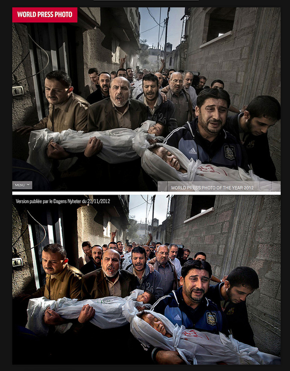 |
| Bottom: Paul Hansen's photograph as it was published by his Swedish newspaper, Dagens Nyheter, on November 11, 2012 |
In the days following the announcement of the World Press Photo of the Year there's been quite a discussion going on in cyberspace about post-processing of news images, and how far is too far given the ethics of reportage and today's digital photography.
There are two interesting points of view to consider today in light of this ongoing discussion. First, Allen Murabayashi has published a commentary on Petapixel asking, "Why do photo contest winners look like movie posters?" Murabayashi shows examples of photographs and makes us wonder whether Photoshop has been used to open up faces, change color and white balance, or apply post-processing vignetting.
"When images cease to look real and to be overly retouched, we have a veracity problem," Murabayashi wrote. "And if we subscribe to the common ethos of photojournalism (i.e. that we are trying not to deceive the viewer), then we have an increasingly enigmatic issue."
But the Twitter link that really caught my attention this morning one to a Flickr page by André Gunthert which shows Paul Hansen's photograph as it was published by his Swedish newspaper, Dagens Nyheter, on November 11, 2012, during the photograph's live news cycle. Gunthert has published a side-by-side comparison of the newspaper's original published image along with the one that earned top honors in World Press Photo's contest.
Unfortunately, I'm old. I've been around Photoshop for a long, long time. When I worked in Silicon Valley ten years ago at CNET Networks I got to meet some of the people at Adobe whose names appear on the Photoshop launch screen. The software has come a long, long way since the early versions. So when I look at these side-by-side files on Flickr, my eyes are drawn to the faces of the six men left-to-right across the image; to the white balance of the shrouds on the bodies of the two children; to the light and range of light on the victims' faces; to the hazy background that exists just over the heads of the procession; and to the density of the sky and the variations in the shadows on the upper left wall (in the photograph's "11 o'clock" position).
Examine the photograph at these described areas and decide for yourself what you think may be taking place in these compositional points. Is this much-ado about nothing, or is there something here that can be used as a "teaching moment" and is there an issue that the industry needs to discuss?
The decision regarding post-processing boundaries is in the hands of the editors who decide what to publish in their newspapers and magazines and Web sites, and in the hands of the judges who pick winning images in contests, and in the crowd-sourcing voice of the world's photojournalists who by speaking out, or by staying silent, self-police the industry by voicing what's okay and what's too far.
The fact that we're having this discussion again must mean that some people think there's a problem. From what I hear and read, it sounds like many are about 50/50 on the issue today. And the particular image being discussed has just taken top honors in two very prestigious contests that were judged and chaired by some of our industry's most ethical and admired professionals. So as I think about this issue, I also think about how much I respect their opinions.
Hansen's photograph was discussed in LENS by Jim Estrin in The New York Times the day after it won World Press, and Estrin asked World Press jury chair Santiago Lyon of the Associated Press about post-processing and the light quality in the photograph. Lyon told Estrin that Hansen's photograph was "within the acceptable industry parameters."
In the interest of full disclosure, I'm also bringing this up again because NPPA will shortly begin judging its own Best Of Photojournalism contest. BOP contest chair Terry Eiler and the committee will assemble a panel of expert judges from around the world who are also some of our industry's most ethical and admired professionals. I'm not part of the judging process, and as of today I have no idea who the judges for BOP will be. But I'm glad this discussion is taking place right now, and I'm wondering if this topic will come into play as NPPA's judges look at the Best Of Photojournalism entries.
Whether one agrees or disagrees on this topic of post-processing in photojournalism, by all means let's hope that this discussion continues. If the contest winners are a signal to young photojournalists about what's okay in image presentation and post-processing manipulation, then shouldn't the picture that's entered in a contest be the same image that was published by its editors?